Adidas USA Sales Dashboard
Unveil Insight With Tableau
Brief Introduction:
Once regarded primarily as a sports shoe brand, Adidas has evolved into a global powerhouse shaping the athletic and fashion landscapes. While its iconic three stripes are synonymous with athleticism, Adidas has transcended its origins, captivating consumers with innovative designs and a commitment to excellence. In this exploration, we'll explore the statistical trends and consumer sentiments surrounding Adidas products. In this exploration, we'll focus on adidas USA, examining statistical trends such as sales, retail performance, comparisons, and product types using insights delivered by a Tableau dashboard. Hopefully, we'll gain valuable insights through this comparison.
The data used is sourced from Kaggle, covering the period from January 1, 2020, to December 2021, specifically focusing on the USA market. It includes key sales features such as revenue, operating profit, units sold, retail information, and locations.
Case Study Scenario:
A senior Adidas executive tasked a data analyst with unveiling actionable insights into the company's US market performance from 2021 to 2022. The executive was particularly interested in evaluating overall sales metrics, identifying trend and performance, and understanding variation for the sales. To facilitate further exploration, the executive requested an interactive dashboard to find out specific time or location.
Adressing the Case Study:
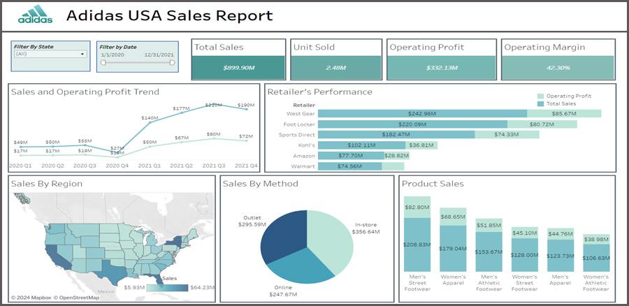
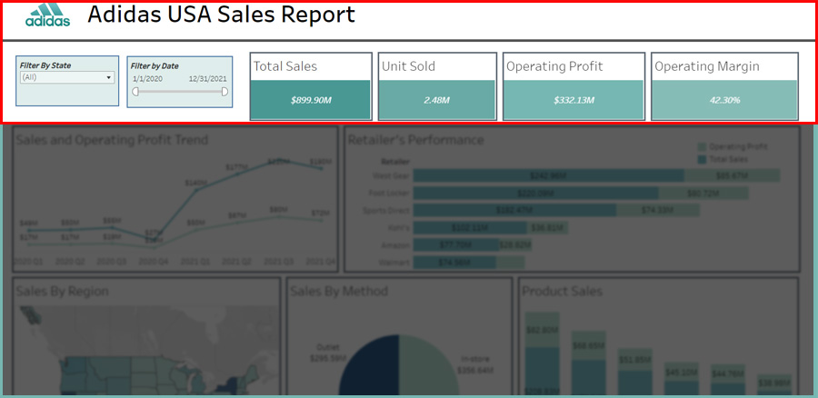
1. Summarizing overall sales metrics in the form of an executive summary.
We can clearly visualize the executive summary at the top layer. This positioning is crucial because the executive summary serves as a priority, offering visibility and providing quick context. As observed, the executive summary consists of total sales, units sold, operating profit, and operating margin, serving as a basis for comparison and insight. For example, we can see quickly that their operating profit margin is 42 percent which was excellent in term of the industry standard.
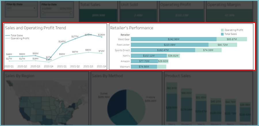
2. Identifying trends over time and performance by retail.
As part of the dashboard, I included a sales trendline to gain insight. Examining the entire period, it's evident that during quarters 3 and 4 of 2020, there was a notable slowdown in growth, largely attributable to the COVID-19 pandemic. Further research during this period revealed that Adidas increased its investment in digital stores. However, in Quarter 1 of 2021, there was a significant increase in sales and operating profit. This uptick can be attributed to the payoff from the digital investment and the easing of pandemic-related lockdowns.From the dashboard as well, we can also assess the performance of the main retail outlets. It can be seen that West Gear and Footlocker emerged as the top two retailers during the two-year period.
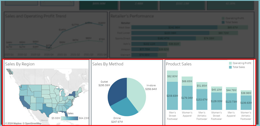
3. Breaking down variations into sales by region, sales by method, and sales by product type.
Analyzing the sales variation, starting with sales regions, we observe from the geospatial heatmap for that period that significant customers are from Texas, Florida, New York, and California. Regarding sales methods, in-store purchases emerge as the preferred choice. Furthermore, the preferred products are men's street footwear and women's apparel.
Therefore, the Tableau dashboard can facilitate swift analysis and insight. Moreover, I've incorporated two interactive filters to enable analysis by specific periods, states, or both. For a simulation, you can explore the Tableau dashboard, click link below:.
Tableau - Adidas Sales Report